Blog
Good Products Deserve Good Design: Introducing the Redesigned RudderStack
Good Products Deserve Good Design: Introducing the Redesigned RudderStack

Brooks Patterson
Head of Product Marketing
4 min read
March 9, 2021

RudderStack is an engineer-focused, developer-first alternative in a world of tools that cater to marketers. We believe deeply in this approach and have written about it before. With our engineering-heavy influence, it probably comes as no surprise that design is one area that’s ripe for attention.
While it’s natural to focus on building more, we know thoughtful design must work in harmony with robust development to unlock our product’s full potential. As Don Norman asserts in his classic on human-centered design, The Design of Everyday Things, “It is up to the designer to provide the appropriate information to make the product understandable and usable.”
We know we can’t fulfill our mission to help data engineers become the heroes of their companies without design that makes RudderStack a delight to use.
Our First Step Towards Design Maturity
Our redesign was launched along with our RudderStack Pro self-serve plans. In the eyes of our Founding Product Designer, Xiang Gao, it is RudderStack’s first step towards design maturity.
The redesign includes several refinements that will immediately impact the user experience, and they’re only a hint of things to come.
Establishing a Visual Theme
As an early-stage company, RudderStack’s overall visual theme is still solidifying. While the current look and feel will change as we progress, these updates indicate the philosophical direction of design at RudderStack. They represent a major milestone in the product’s visual identity. We’ve defined new styles for everything from buttons and dropdown menus to table displays, meaning you will now enjoy a more refined and cohesive visual theme throughout the application.
Improving Navigation
No matter how powerful and full-featured a tool is, its real-world value is capped if users can’t easily move through the application to accomplish their tasks - not to mention discover new ways to use the app. With the release of the redesigned RudderStack, you will benefit from several navigation improvements.
Enterprise Friendly
Now always visible, the navbar features an enterprise-friendly company dropdown, allowing you to easily create multiple workspaces, add users, and manage permissions.
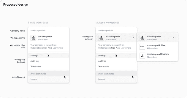
Enterprise Friendly
Improved Aesthetics
You’ll notice visual refinements such as tighter grouping, a new color scheme, and RudderStack branding in the navbar.
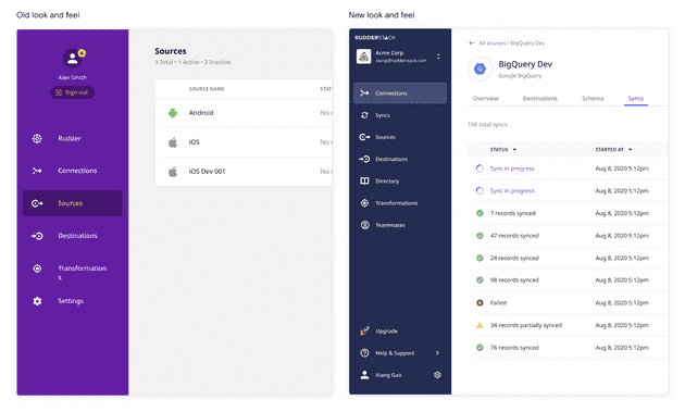
Improved Aesthetics
2nd Level Navigation for Source, Destination, and Transformation Details
You can now drill down into each Source, Destination, Connection, & Transformation to see exactly what’s happening inside and perform more operations within each one.
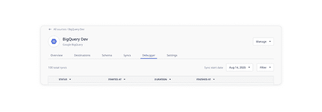
Drilling Down
Designing new Features
Our redesign also includes new design features to help you visualize the functionality of RudderStack.
Syncs
See sync information between each integration:
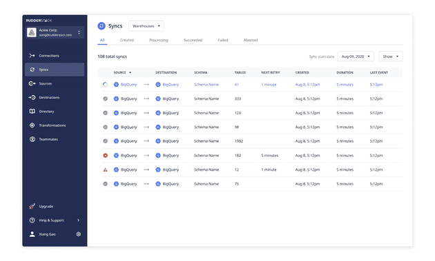
Syncs
Audit Log
See a history of everything that happened on RudderStack.
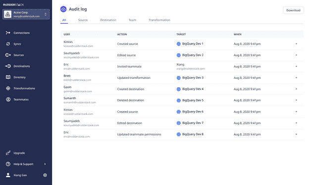
Audit Log
Just the Beginning
These refinements represent a foundation. We’re excited about the UX improvements we’re introducing today, but we’re more excited about what this means for the future. Our team is working on a major design overhaul to harmonize further the robust functionality of RudderStack with its product design, so you can unlock its full potential and discover every feature. We’re also working to unify the product with our outward-facing brand, and we’re launching a new website soon - keep your eyes peeled. This is just the beginning.
Sign up for Free and Start Sending Data
Test out our event stream, ELT, and reverse-ETL pipelines. Use our HTTP source to send data in less than 5 minutes, or install one of our 12 SDKs in your website or app. Get started.
Published:
March 9, 2021
More blog posts
Explore all blog posts
Stop flying blind: Real-time JavaScript SDK debugging with the RudderStack Tracking Assistant
Drew Dodds
by Drew Dodds

Data without compromise: The RudderStack story
Danika Rockett
by Danika Rockett

Snowflake Summit 2025 recap: Launches, live demos, and real-time data
Ricky Spiese
by Ricky Spiese


Start delivering business value faster
Implement RudderStack and start driving measurable business results in less than 90 days.

